Location: GUIs >
Windows >
Windows 8 Service Pack 1 (Windows 8.1)
Windows 8 Service Pack 1 screen shots
(AKA Windows 8.1 or Windows NT 6.3)
Normally I don't review service packs or minor updates, but Microsoft has
hopped on the "rapid release" fad and can't seem to make up their mind
if this is a proper service pack or full new OS version.
While it is "free" to users that purchased Windows
8, there are some significant differences to other service packs:
-
Microsoft has made some high-level user interface changes that could invalidate
existing documentation. Proper service packs or minor updates avoid this
where possible.
-
Although OS service packs usually make changes to the OS kernel, Microsoft
has bumped the NT kernel version number. This may break applications that
check the OS version in this way, even if they are otherwise compatible.
-
Reportedly, this update does break many applications. Any change can break
things, but a proper service pack attempts to minimize breakage.
-
Microsoft is not offering a standalone updater. The only place for users
to get the update is from the online Windows Store. Users who can not or
do not want to use that are left searching for torrents of the full DVD
ISO. Obviously the idea is to force people to the Windows Store.
-
After the release of a major service pack, new CD/DVDs usually include
the service pack but retain the same product name. However Microsoft has
changed the name from Windows 8 to Windows 8.1.
What Microsoft calls it is largely unimportant. We could retroactively
start referring to Windows 7 SP 1 as Windows 7.1, and it wouldn't make
any technical difference. But if Microsoft really is moving away from treating
these yearly/periodic updates as just service packs, disregarding stability
and compatibility, that will become EXTREMELY BAD for anyone needing a
stable application platform.
So let's take a look at what has changed:
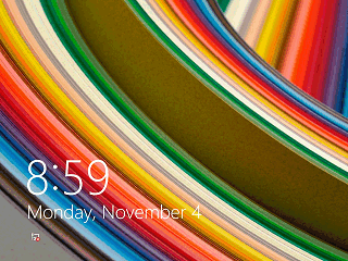
The completely unnecessary "Lock Screen" still doesn't give any visual
indication as to what you are supposed to do to continue. No change here.
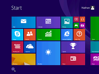
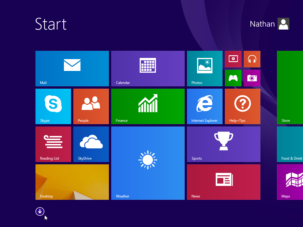
Same dumbed down full-screen Start page, but now an arrow visibly displays
in the lower left that will take you to the previously hidden "Apps" screen.
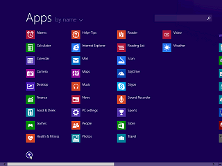
Similarly, the Apps screen now has an up arrow that returns you to
the Start screen.
This message briefly popped up once to indicate where the invisible
"Start" corner is.
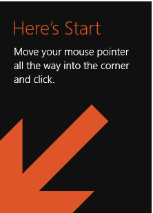
Moving the mouse down towards the "Start" corner in a Metro app now
pops up a little Windows logo button that returns you to the Start screen.
That is a baby step in the right direction, but how about giving us something
that is persistently visible to select? Oh, right, we HAD that.
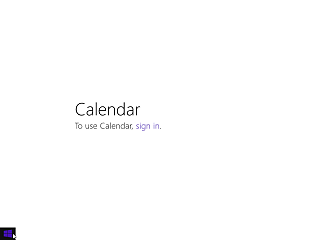
There is still no visible way to close a Metro application. And the
Calendar still does not have a "Cancel" option, keeping you in an infinite
loop until you give in.
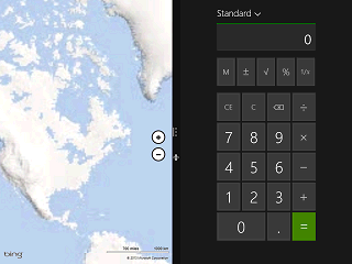
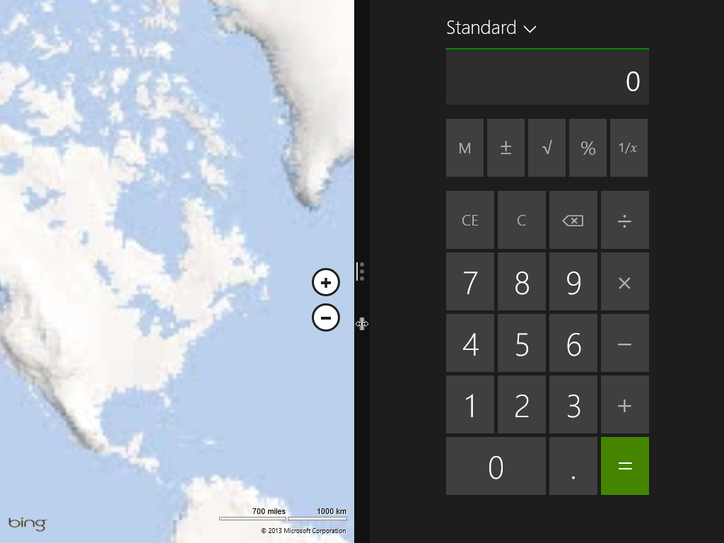
Metro now graciously lets you use TWO half-screen apps at a time on
lower resolution displays! Wow, they are starting to catch up with Windows
1!. Unbelievably they focus on this change in some recent Windows advertisements.
Oh, and a Metro-ized calculator app. Surprisingly it doesn't require
me to connect to a remote server to add two plus two. They will probably
"correct" that oversight in Windows 8.2.
Of course, Windows 1 is still superior in several respects: applications
have a visible way to close them through their system box or menu, and
you can visibly see other open applications at the bottom of the screen.
On a side note, it seems like more people are referring to "Metro" as
"Modern UI", a brief last minute name change made just before the release
of Windows 8. Officially they are just called "Windows 8 apps" now. But
anyone who thinks Windows 8 is "modern" in any way needs to be kicked back
to the 1980s and forced to use Windows 1.
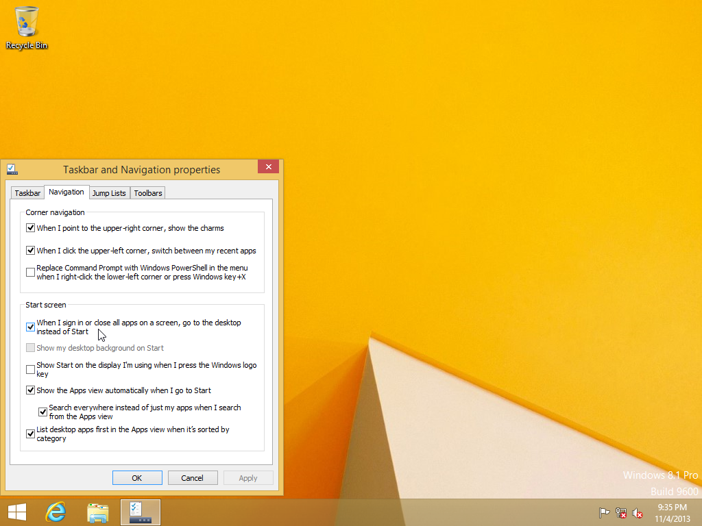
Back on the classic desktop, Microsoft added a visible "Start Button".
This does NOT display a Start Menu. Rather, it takes you back to the
full-screen Start Screen.
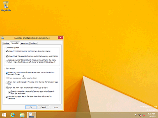
They have added an option tab in the Task Bar Properties that lets you
chose to start directly to the desktop. But this isn't very useful when
it just throws you back to the Start Screen.
An interesting annoyance: How are you supposed to even get to this anyway
without a control panel option visible anywhere? In Windows 8.x you have
to right-click on the task bar. But remember that right-clicking is supposed
to be for "advanced" options, and is considered "non discoverable".
In Windows 95 all I have to do to get here is select Start->Settings->Taskbar.
The other options in the Navigation tab let you choose to display the
Apps Screen, sorted with real desktop applications first, when you click
the Start Button so at least what you see is not completely useless.
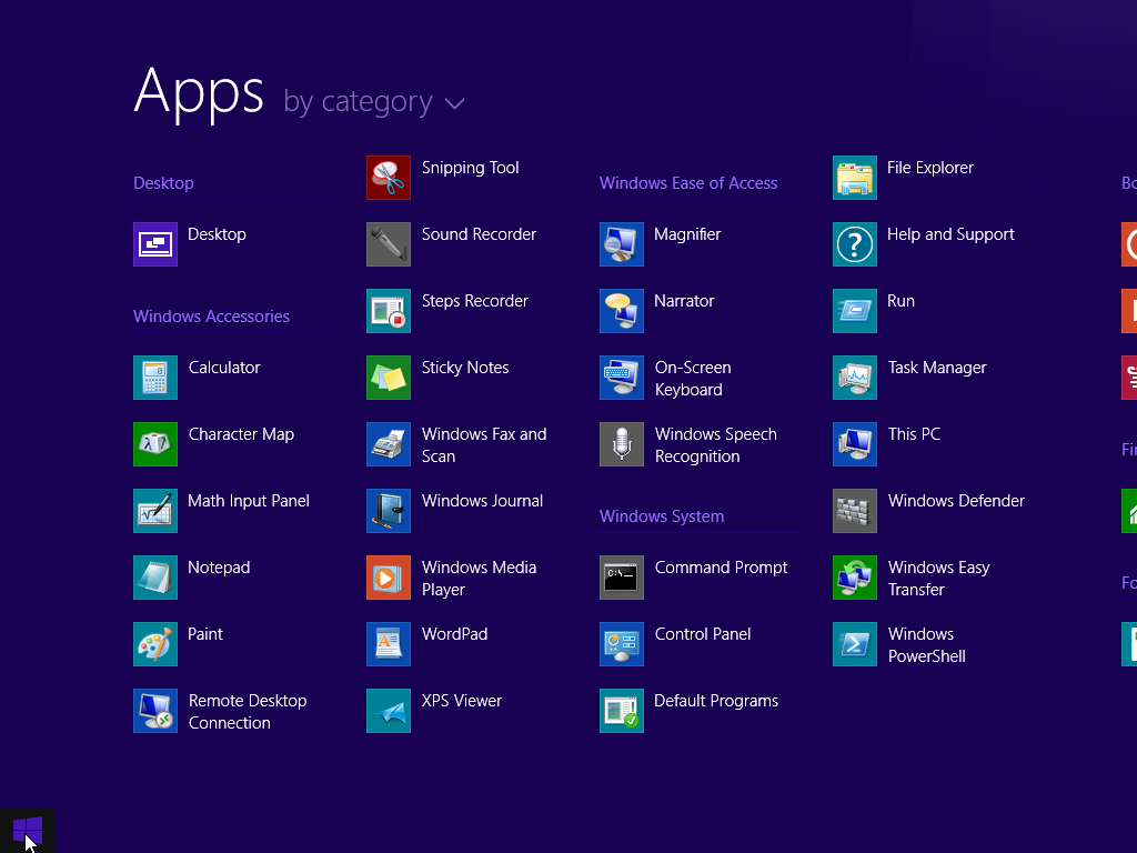
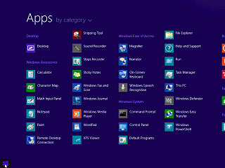
I will point out again that this screen will easily become a mile long
on a fully loaded computer.
It is tempting to compare this long, full screen, scrolling, list of
programs to the Windows 1 MS-DOS Executive in programs view. But at least
with Windows 1 you can browse among different program directories!
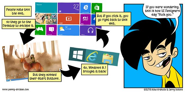
This Penny Arcade comic strip http://www.penny-arcade.com/comic/2013/06/28
sums up Windows 8.1 pretty well.
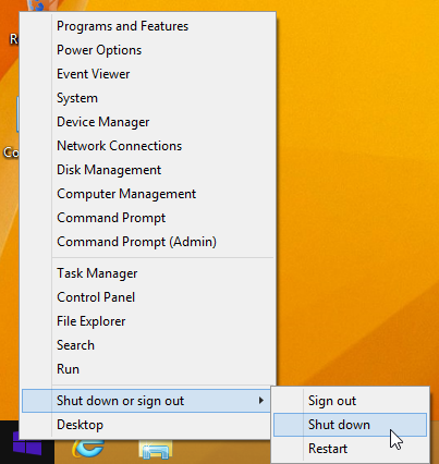
Shutting down Windows 8.1.
Microsoft graciously added a shut down option to the Start Button right-click
context menu! Again a baby step in the right direction, but why not just
put a visible shut down option on the Start or Apps page? Oh, that would
be too useful.
Anyone who does not understand why input device consistency and simplicity
is important should review interfaces like Word
1 for DOS or learn the 3-button finger dances needed to operate early
Sun
Solaris and it should become clear why Apple's original MacOS
used only one mouse button.
In conclusion Windows 8.1 is still a horrible, confusing, cluttered
mess. Like a service pack, there are just a few changes. Most changes are
minor, except for what is shown above. It hasn't really changed anything,
and deserves no fanfare.
|