|
|
Location: GUIs >
Windows >
Windows Vista (NT 6.0) Screen Shots Well, now that Vista is finally out I guess I should add some screen shots. This is actually a "release candidate" version but I haven't yet come across the final version and I am not about to run out and buy one. At any rate this appears to be close enough for a few quick screen shots.
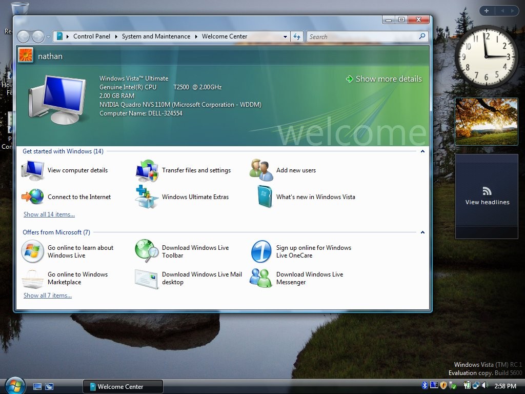
Hmmm... I have seen this somewhere before. Oh, right, MacOS X has been doing this for quite a while now and this somewhat mimics the Aqua look. Oh, well, nice to see Microsoft finally catching up in the area of 3d video accelerated desktops. When you first start Vista you will see the "Welcome Center" that just shows some common things you might want to do if you are new to Vista. In the past there have been "home" "professional" and "server" versions of Windows, but now they have dozens of different versions with such creative names as "Home Premium" and "Ultimate" that bring images of gas pumps to mind. Even more confusingly it seems they are now pushing their 64-bit versions of Windows a bit more.
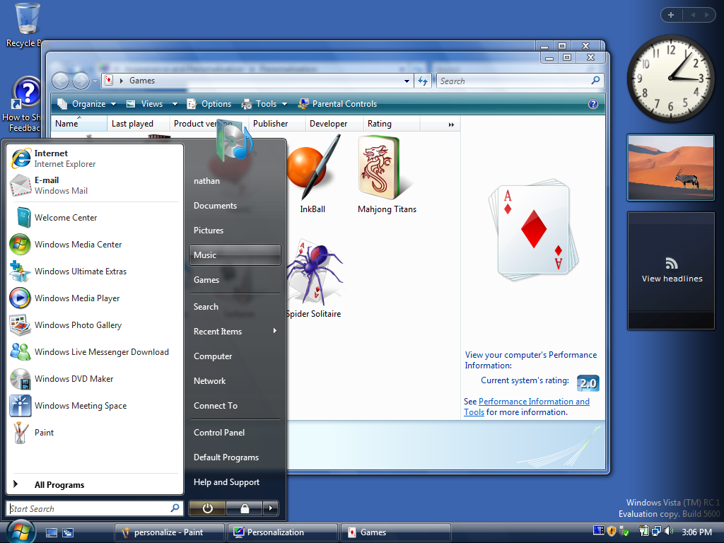
And by this time I am getting a little annoyed with that "Sidebar". I don't need a second clock, I can't even read old-fasioned analog clocks very easily anyway, that RSS feed thing isn't going to connect to anything since I'm not configuring IE... and WHAT IN THE HELL gives with that picture that keeps changing? Supposedly you can add additional "gadgets" to it, but I don't see why anyone would really want to. It seems like I have seen this somewhere else... Right, MacOS X calls this the "Dashboard", except theirs is not this annoying and Apple doesn't stick it in your face.
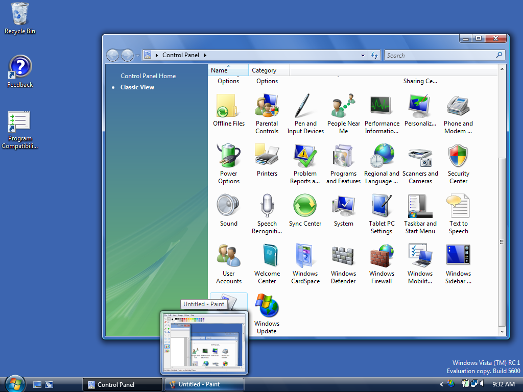
The Windows control panel still defaults to a webby view like similar
to Windows XP, but thankfully you can still select "classic" mode, as shown
above. (Classic mode is actually more like MacOS, but that was ripped off
way back in Windows 3.0)
|